Before we begin, a small heads-up.
If you want to master the concept I’m about to walk you through, the complete framework is part of my Price Acceptance Concept, along with the custom-built indicator that mechanically identifies these ranges for you. Learn it here: https://msptraders.in/price-acceptance/
Now let’s get into the story.
How XYZ Fell Into a Long, Silent Range
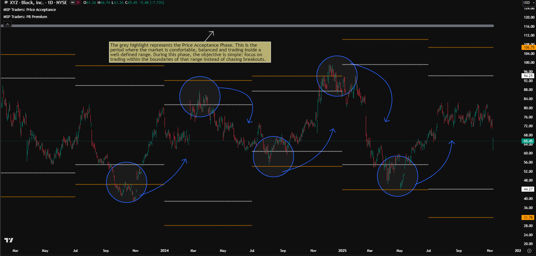
XYZ Block has been quietly moving inside a massive range since mid-2022. No rush. No hurry. Just slow, steady back-and-forth movement that most traders scroll past without thinking twice.
The funny part is that this “boring” zone holds one of the strongest edges.
You just need the eyes to see it.
When XYZ kept bouncing between the same boundaries for months, it didn’t feel random. It felt like the market was telling a story. A story of balance. A story of stability. A story of acceptance.
When Markets Stop Moving, Something Important Is Happening
This is where Price Acceptance shows up.
When price doesn’t trend, doesn’t break out, doesn’t collapse… it’s not stuck.
It’s comfortable.
This is the part that confuses beginners the most, because real-time ranges are messy. They don’t look like clean textbook boxes. It takes experience to see them forming layer by layer. I struggled too, which is why I built a mechanical approach to spot these phases instead of depending on instinct.
The Chart Becomes Clear With the Right Levels
On XYZ’s chart, the structure starts revealing itself when the levels come into focus.
White lines show the previous period’s high and low. Here the chosen period is 6 months, so these are the previous 6-month boundaries. Orange lines show R1 and S1, the outer reference points where reactions become meaningful.
Whenever price pushes into the previous 6-month high or moves near R1 and gets rejected, it often drifts back inside the range. The same happens near the lows and S1.
Slowly, the market paints its own rhythm.
The Grey Phase: The Market’s Way of Saying “Range Mode”
On the chart, there’s a grey highlight.
This grey phase is the Price Acceptance Phase.
It’s the market’s quiet signal that the environment is balanced.
Grey means the story is simple:
This is a time to trade inside the range, not chase anything outside it.
No drama. No urgency. Just structure.
Choosing Your Timeframe Becomes Easy With the Indicator
Different traders prefer different lenses, and that’s exactly why the timeframe inside the indicator matters.
Change it to quarterly, monthly, semi-annual, yearly… whatever matches the way you trade.
The moment you switch the timeframe:
The range updates
The boundaries shift
The grey acceptance signal adapts
Everything realigns instantly.
No redrawing. No guessing.
This is the same indicator I provide inside the Price Acceptance Concept, and it makes the entire process smooth.
What XYZ Teaches Without Making Noise
Charts don’t always shout. Some of them whisper.
XYZ has been whispering since mid-2022, telling a quiet story of balance, stability and repetition.
And once you learn to see that story, you’ll never look at a sideways market the same way again.
Learn Price Acceptance + Get The Indicator
If you want the full concept that powers this story, along with the custom indicator, you’ll find it here:
https://msptraders.in/price-acceptance/
Have a doubt or want to understand a part of this story better?
Drop your questions in the comments.
And if you enjoy case studies like this, follow on social media for more breakdowns, examples and quiet little stories the market keeps telling every day.
Cheers !!
Arup MSP
Creator of Pivot Mastery (The Practical Way to Understand Market Context)
Social Profiles:
Follow on X
Follow on Facebook